Great Southern Bank Navigation

The Challenge

Great Southern Bank’s primary navigation had grown overly large and complex, resulting in low customer engagement and limited discoverability of key journeys. The breadth of options created cognitive overload, making it difficult for customers to quickly find relevant information and complete tasks efficiently. This complexity reduced the effectiveness of the navigation as a tool for guiding users to high-value and frequently used experiences.

The Solution

Simplified and restructured the navigation using a customer-centred, data-driven approach. Navigation items were consolidated and prioritised based on user behaviour, analytics, and top customer tasks, reducing cognitive load and improving discoverability. Clearer information architecture, consistent naming conventions, and progressive disclosure were introduced to surface high-value journeys while deprioritising low-use content.

Role
Senior UX/UI Designer

Project Management
Agile Scrum Methodology

Tools
Figma, Workshops and Adobe Anlytics, Crazy Egg

The Process

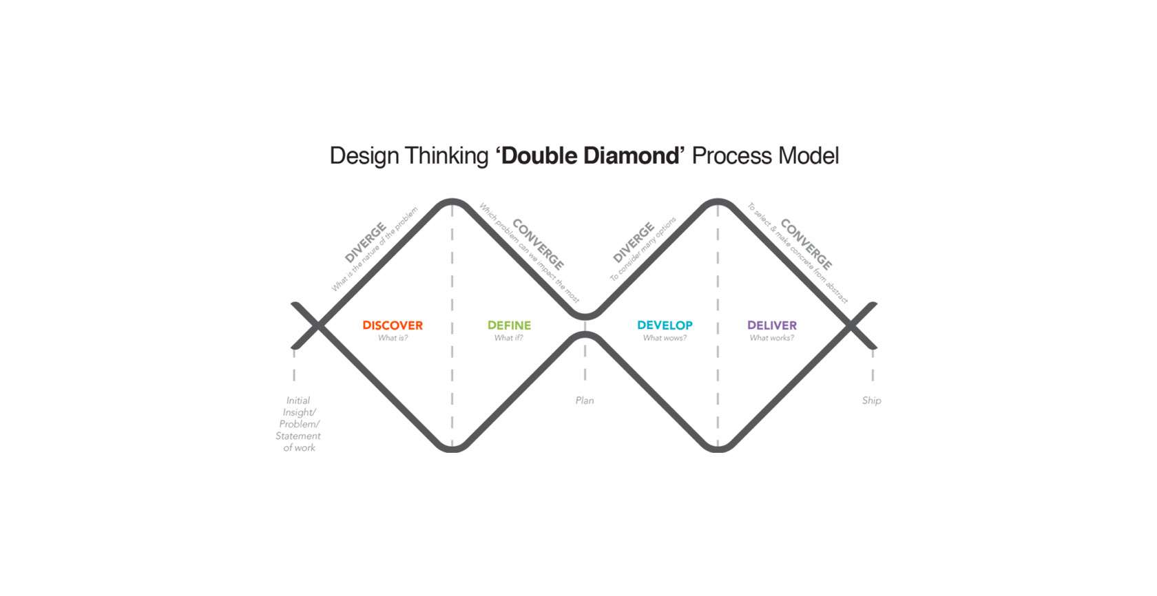
To address the challenge, I adopted the Double Diamond process model, a proven framework for solving complex design challenges.
Discovery

During the Discovery phase, we ran multiple workshop sessions with stakeholders and team members to uncover pain points and priorities. We analyzed Adobe Analytics to understand customer click-through patterns and identify which areas of the navigation were being used—or ignored. Additionally, we leveraged Crazy Egg heatmaps to observe user interactions, uncovering engagement trends and friction points. These insights provided a clear picture of customer behaviour and informed data-driven decisions for restructuring the navigation.
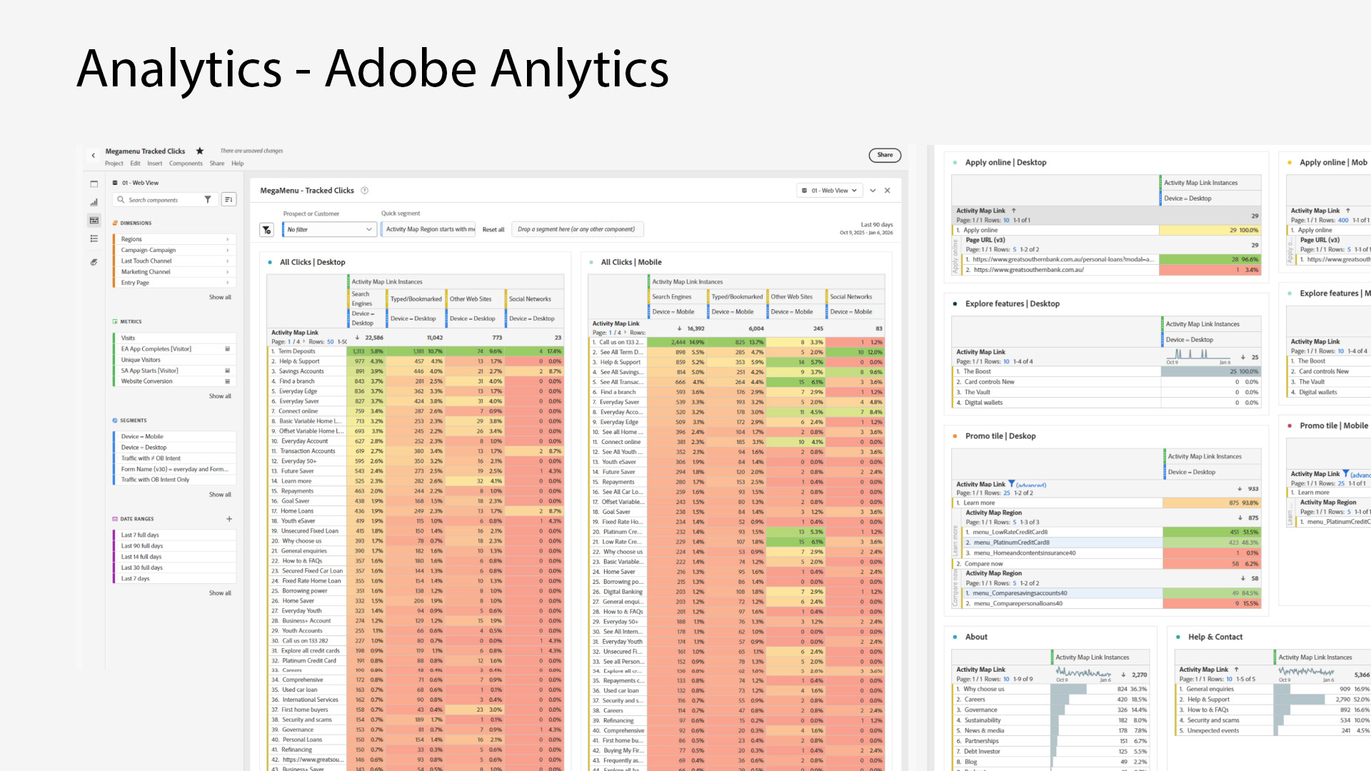
Adobe analytics information gathering
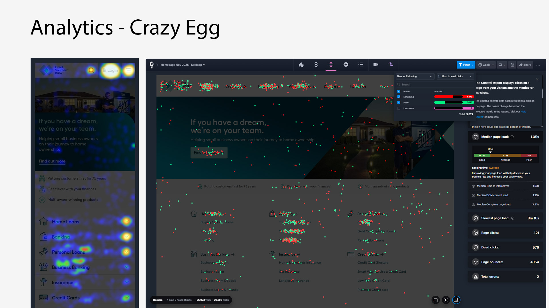
Crazy egg analytics information gathering
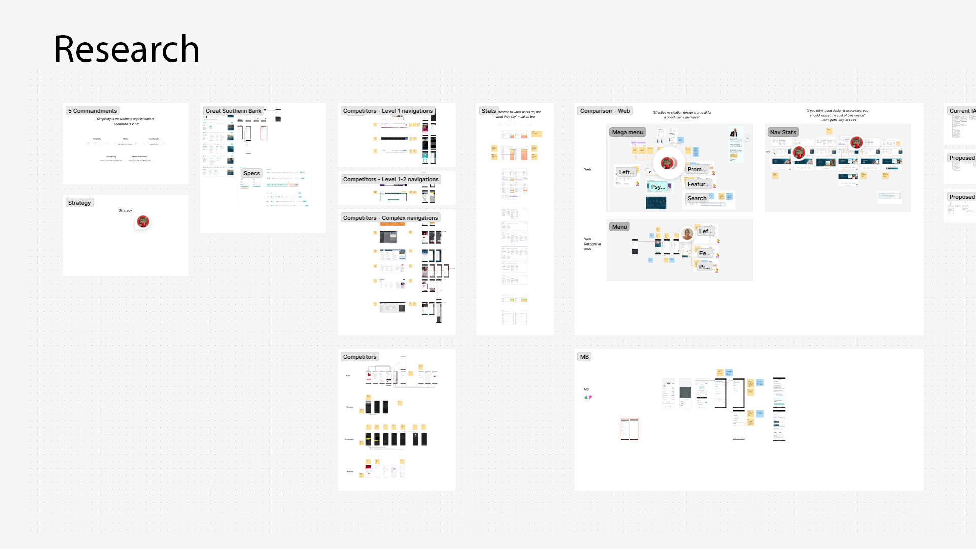
Indepth Analysis of GSB navigation

Consolidation
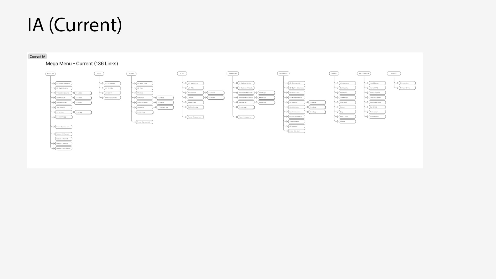
I mapped how customers flow through the website to identify common paths, drop-offs, and friction points. A competitor analysis helped uncover best practices and opportunities to differentiate the experience. By studying analytics data, I validated assumptions with quantitative evidence, highlighting which content and features were most valuable to users and where improvements were needed. These insights formed the foundation for designing a more intuitive and efficient navigation experience.

IA mapping of current navigation

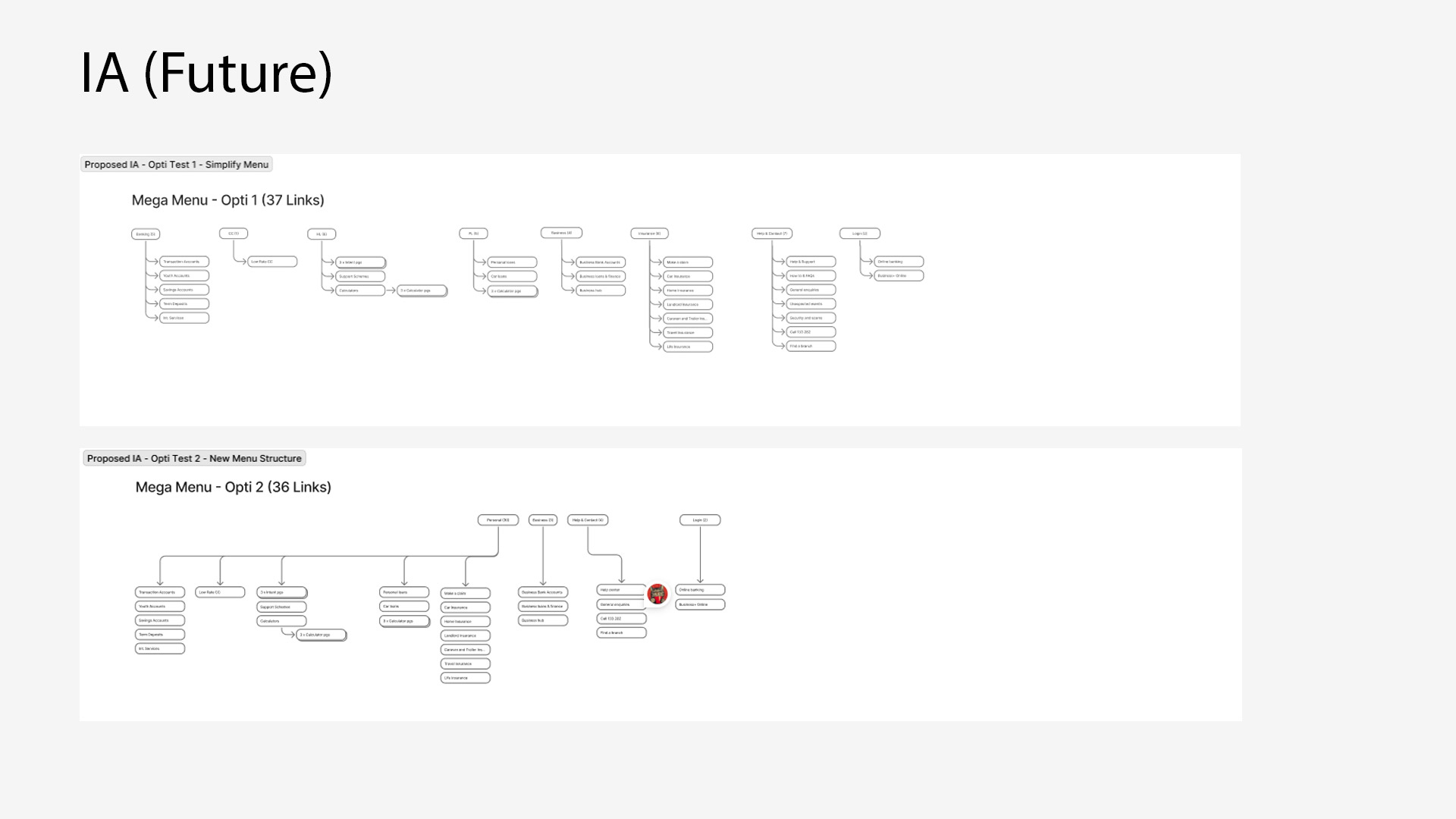
IA recommendation for experiments

Experimentation
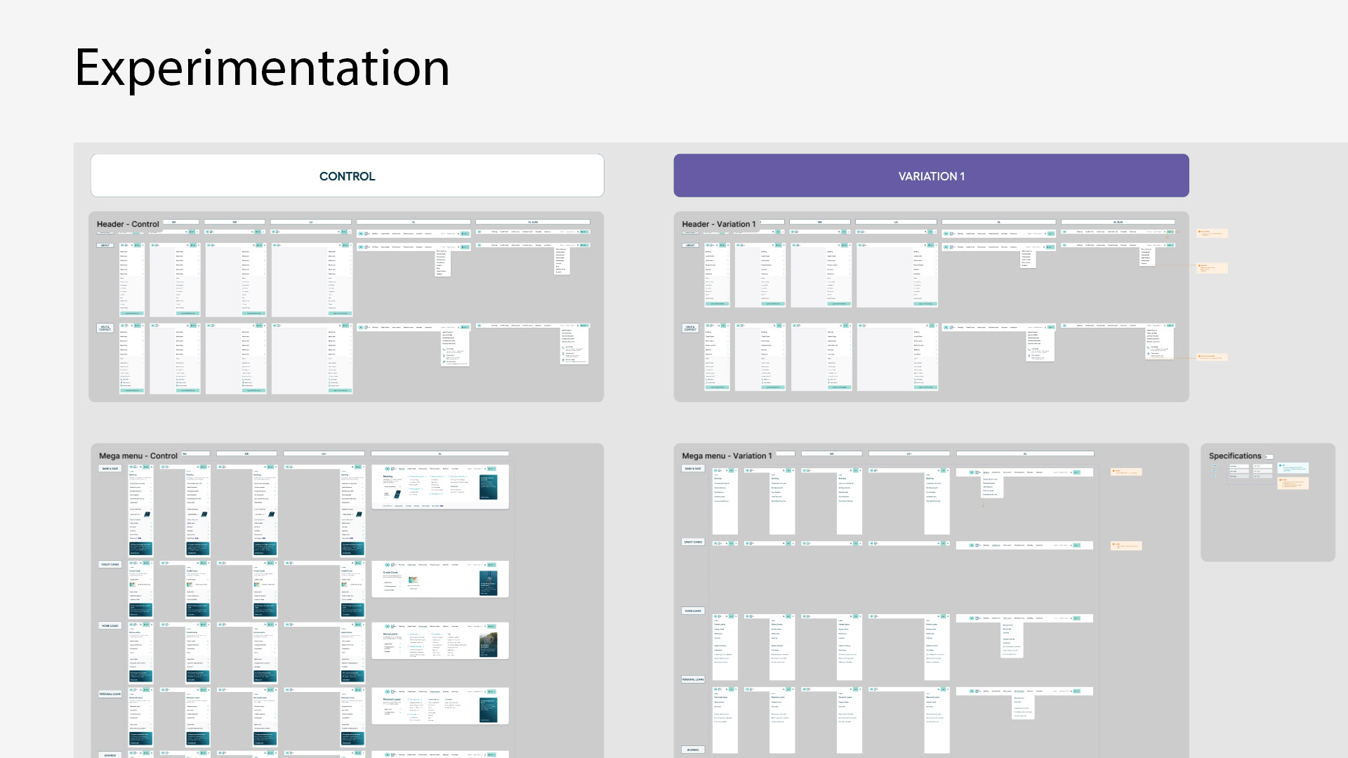
The redesigned navigation was deployed as part of an experimentation phase to validate improvements with real users. Using A/B testing and engagement metrics, I measured how the new structure impacted click-through rates, task completion, and overall user behaviour. Early results provided actionable insights, confirming which changes improved discoverability and usability, and guiding further refinements before full-scale implementation.

Control vs Variation 1

Conclusion

Experimentation still in progress.